VALORANT Designer on sunset inspiration and scrapped concepts
VALORANT Lead Map Designer, Joe Lansford, has discussed the inspirations behind the Los Angeles-based map Sunset.

Jack Marsh
26th Aug 2023 20:00
Riot Games
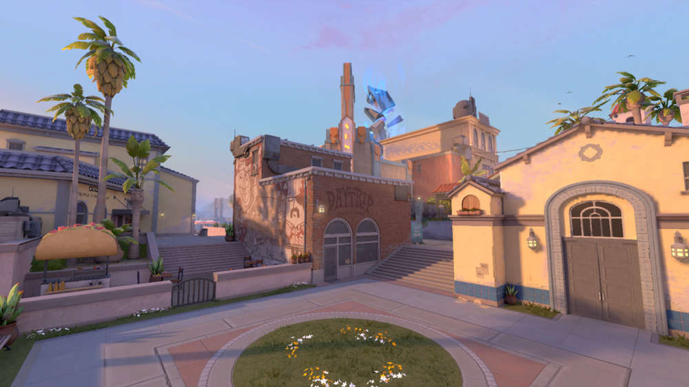
It's finally here. After weeks of leaks and behind-the-scenes tweaks, Sunset is arriving in VALORANT Episode 7 Act 2 as the tenth map.
Sunset has been officially announced by Riot Games for VALORANT at the VCT Champions pre-show.
But as one of the most close-to-home maps that Riot Games has ever made, Lead Map Designer Joe Lansford spoke to GGRecon about the influences behind the Los Angeles-based map, its scrapped concepts, and which agent meta it suits.
VALORANT's Sunset map is all about mid-control
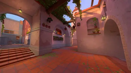
Much akin to the likes of Ascent and Pearl, Sunset arrives as a two-site map that will heavily rely on who can gain control of the mid-lane, cutting off rotations and site pushes, giving emphasis on lurking and team push cohesiveness.
"With Sunset, we started with some pretty simple goals actually. We wanted a two-site map. We wanted to lean heavily into mid-control so teams could fight over that space and gain an advantage there, and then we wanted to use a little more pivot cover than we normally do," Lansford said.
"VALORANT has several versions of the three-lane map formula, but we haven’t made one with a strong focus on mid-control in a long time. Sunset features a mid that is fairly difficult to control and doesn’t really favour one team or another; it’s generally good for rifle ranges and opens up a bunch of opportunities for whichever team can take it.
We expect to see both teams make mid-control a central part of their strategy on Sunset."
VALORANT Designer eyes Viper and Harbor to thrive on Sunset
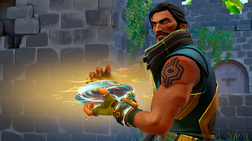
With the agent pool set to be in for quite a shift, Sunset appears to be leaning in favour of the meta. Out with Astra and in with Harbor. Astra is set for some balances in the upcoming Act, with many feeling like her Gravity Wall nerfs will be significant enough to remove her from the professional meta, making way for Harbor to flourish - and this might just be the perfect reckoning for Sunset.
Lansford revealed that in early tests and gameplay with VCT Champions players, Wall Smokes appeared to be some of the most successful utility, as he pointed out that "Viper and Harbour" will be good composition picks for this map.
In an early showcase with VCT Champions media, players such as Óscar "mixwell" Colocho played ten rounds of Sunset action, where Neon was also rather effective.
Players were also found using a lot of shotguns to gain that mid-control, although this diminished in the later stages of rounds as re-takes occurred, should they fail to loot a Vandal or Phantom off the floor.
VALORANT Map Designer details scrapped Sunset concepts
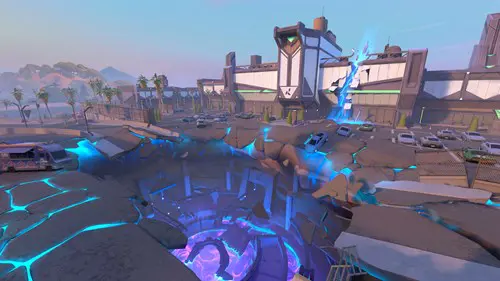
While showing off the design process for Sunset, Lansford revealed how they often start with very over-complicated map designs before stripping them back.
One of these appeared to be the involvement of Ascent-like doors. The closing panel doors are effective on Ascent to help block A-site access and to serve as recon, knowing a player has to shoot and break it to gain access, revealing their location.
But the Sunset variant was scrapped in design. "We ended up getting rid of the door. It was causing some other complexities that we were having difficulty working through. We gave a piece of cover for defenders to work with instead, so if they take some aggression, take some space, they're not just caught out in the open," Lansford said.
The map also went under surgery on B-site.
"Over on B site, it was super open. We had a lot of big open space here, a couple of pieces of cover, and then you could see another Ascent-style door. If you broke that thing out, you had a sight line all the way from B across mid - a super long sight line cutting across like two-thirds of the map and a lot of open space.
But, it was just very hard to deal with for everybody. Defenders had a hard time holding it. Attackers had a hard time holding it post-plant, so we ended up adding a little more cover here, tightening up the space a bit, and getting rid of some of those long sight lines."
Lansford also revealed the same process was taken on Lotus, which originally had an acid pool that would tick away at players' health if they were knocked into it with utility, but this was later removed.
VALORANT Map Designer reveals how Sunset was stripped of 'complexities'
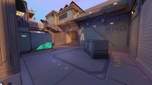
With so many scrapped concepts for Sunset, Lansford explained that this is actually a normal procedure for the VALORANT map designing team, as they often throw as many ideas as possible at the wall and see what sticks. Usually, very little does stick. Instead, they start with chaos and then take a lot of it away to allow the players to be the main attraction, not the map itself.
"Sunset [originally] turned out to be a little bit too complex, so we removed some of those complexities.
We basically removed all of the complexities from the first map design. Most of our design iteration is like peeling back the layers of the onion. We start very complex and then we kind of reduce it.
One of our design philosophies on VALORANT is that we don't want the map to drive too much complexity. We want the complexity to come from the players and the agents they choose, their utility, the strategies, and the tactics that they bring. That's where we want players to have interesting complex moments and decisions to make game after game."
VALORANT's Sunset map designed in Riot Games' backyard
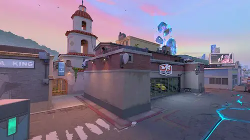
Sunset is heaving with Los Angeles references and inspiration, having combined city staples and architecture with the home life of Gekko - VALROANT's poster-agent of late.
But mainly, the design was influenced by Riot's Los Angeles-based team, with Californian developers taking field trips around the city where Riot HQ is based to capture its essence.
"We get to do a whole bunch of research. LA is right in our own backyard, so we literally walked outside and took reference photos.
We wanted to show the vibrant industrial nature of our city. We've got a whole bunch of old factory buildings that have been converted into clubs, gastro pubs, and breweries, that sort of thing. We really wanted to show LA's positive diversity; what I mean by that is LA is a cultural melting pot of peoples and nations and identities, much like our VALORANT player base, so we wanted to represent our global audience in this map as well."
The map also consists of a lot of local influence, including artists from the area.
"I was born and raised in California, so I love this type of architecture," Lansford continued. "Over in attacker spawn if you look closely at the brick building, there is a skate shop with a mural on it. This mural is actually from a local LA artist - we worked with a few different local artists to get their art actually made in-game."
It wasn't all sunshine and cocktails making Sunset though, as Lansford detailed that there were a few tricky layers of the onion peeling that began to create tears.
"We did have a few challenges on this map, though, and the biggest one was lighting. It's that golden hour, vapour wave, LA sunset time, which is really cool and has a great vibe but isn't the best for gameplay. You get long, high-contrasty shadows, and when you get that in gameplay space, it makes like for some gnarly clarity issues. So we had to work very closely with our lighting artists to kind of find that sweet spot that works for both mood and for gameplay."
Sunset will launch on August 29, arriving with the re-addition of Breeze to the map pool, where Fracture and Pearl will make way.

About The Author
Jack Marsh
Jack is an Esports Journalist at GGRecon. Graduating from the University of Chester, with a BA Honours degree in Journalism, Jack is an avid esports enthusiast and specialises in Rocket League, Call of Duty, VALORANT, and trending gaming news.
